Skywatch #7 - Hot off the press

It's Friday, which means it's Skywatch day!
Today's Skywatch is going to be a little different to previous ones, but there's a reason for this - previous Skywatch posts have mostly consisted of older content from much earlier in the games development (e.g. concept art, early renders etc.) with a sprinkling of more recent updates for good measure, within the context of the theme of the post. Whilst I'm personally happy with the format of our Skywatch posts, and based on feedback from the community it seems that most of you are too, we have had a few comments asking just how up to date the content that we're sharing with you all is, and asking if we can show some more up to date stuff to give an idea of where the game is at right now.
So, for this weeks Skywatch I'm dropping the theme and instead I'm sharing some hand-picked content from our last two DevWatch emails (DevWatch is the Open Development Community version of Skywatch, with more up to date content that gets shared regularly with the Lost Skies Open Development Community). Hopefully this will give you an idea of how things are progressing, as this stuff is pretty much bang up to date and is hot off the press. To be clear, there's still a lot of concept art being done even now, because that's how game development works: new features/assets are created over the course of the games development, which require concepting. It's not like everything is concepted at the start of the project, but nearly everything shared within this Skywatch post is from within the last 4-6 weeks, so gives a pretty current look at where the project is at right now.
One final note - after this week our Skywatch posts will be changing from a weekly release format, to every two weeks. Boo! I know, regular content updates are amazing, but as mentioned earlier, the reason I was able to release weekly posts up to this point is because we had a huge back catalogue of older content to share with you all, but as we start to catch up to where we're at in-terms of progress, we need to slow things down a little bit or risk running out of content to share. Thanks for your understanding and we hope you enjoy this weeks more current look at how Lost Skies is shaping up.
Concepts
Let's start with some of the recent concept art that our art team has been working on. First up, we've started work on concepting our weapons, which you can see in the two pieces below. The first image shows off some different rifle and SMG concepts, whilst the second image shows off how a weapons appearance may differ based on the tier system, using the sniper rifle as an example.
Below is some concept art of one of our puzzle pieces, for our data relay puzzle. We'll share more in-depth information about our island puzzles in an upcoming blog post, but basically there will be different types of puzzles in Lost Skies, many of which require unique assets to be made. The relay puzzle is one such example. The first image below shows the earliest designs of our date relay puzzle asset, the second image demonstrates how our artist iterated on these original concepts, and the third image is the design we decided to take forward.
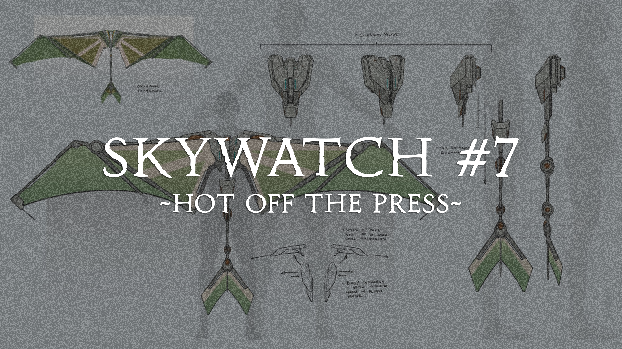
Next up, this one's a biggie - our artists have started concepting the wingsuit, or glider. The glider will serve as an extra traversal tool for exploring islands and we know our former Worlds Adrift players will be very happy to see its return. The concepts below show different design iterations, with the third image being the design that we're taking forward.
The last piece of concept art we have to share with you this week is for our sawblade cutting tool. The design of the gauntlet for this tool is based on Gall technology. Gall generally used more decorative and elaborate designs, with lots of smooth edges as opposed to the more angled geometric designs favoured by Sabor.
Renders and Animation
Next up, a look at some of the recent asset renders and animation work our 3D artists have been focused on. First up, our bird model. We've already shared this with you in the Creature Concepts Skywatch a couple of weeks ago, but this is one of the recent models we've been working on so we feel it's worth showing it again.
Below is a look at our deer with the textures swapped, so the more colour blue fur on the stag, and the more muted brown textures on the female deer model. The reason for this texture swap is because we want to make sure that our creatures have variety even within the same species.
Sticking with our creature renders, below is another look at the Nautilus render we shared a couple of weeks back. Once again, this is quite recent work so worth including here.
Below is another look at the campsite assets that have recently been modelled.
The image below offers an up to date look at our female travellers outfit.
The render of the data relay puzzle asset that we showed concepts of above can be seen below.
And finally, below are some of the early rendering and VFX work that's started on our gathering tools, showing off our mining tool and cutting tool that we shared the concept art of above.
And finally, a quick look at our "manta slime" asset. Our manta now has a "spit" attack and this effect is intended to be used for that.
Ship Assets
On to our ship progress! The images below show some of the work that's been completed on our prefab ship. This ship is intended to be used in the next trailer for the game, which will show off some early basic gameplay. This prefab ship is designed to stay as close to one of the original ship concepts as possible, which the team are working from as a baseline. Whilst the ship is a prefab, it's intended to demonstrate the flexibility of the shipbuilder.
Firstly, below are some images of our first ship bow decoration, or "figurehead" decorative item.
Next up, some of the wood texture/shader work that's begun for our ship deck/panelling assets. This is super early shader work, so don't expect the final wooden textures to look exactly like this, but it gives an idea of the process our artists are currently following to find a shader that works within the games aesthetic, whilst staying true to the ship concept art we're wanting to match as closely as possible.
And finally, a look at out our assembled prefab ship as it looks right now. Obviously this isn't final, but as you can see, we're following one of the original ship concept pieces and trying to match that style as closely as possible. Because of the complexity of the concept ship, this meant that some brand new assets had to be made from scratch - the metal "canopy" on the top deck, the metal side extrusion that the wing is mounted to, the figurehead as shown above and the tail "fin" asset that sits below the stern. The rear viewing deck will also likely need to be a custom asset, but hasn't been modelled yet.
Bear in mind that just like the wood shaders shown above, the metal textures/shaders shown here are not final.
Island Updates
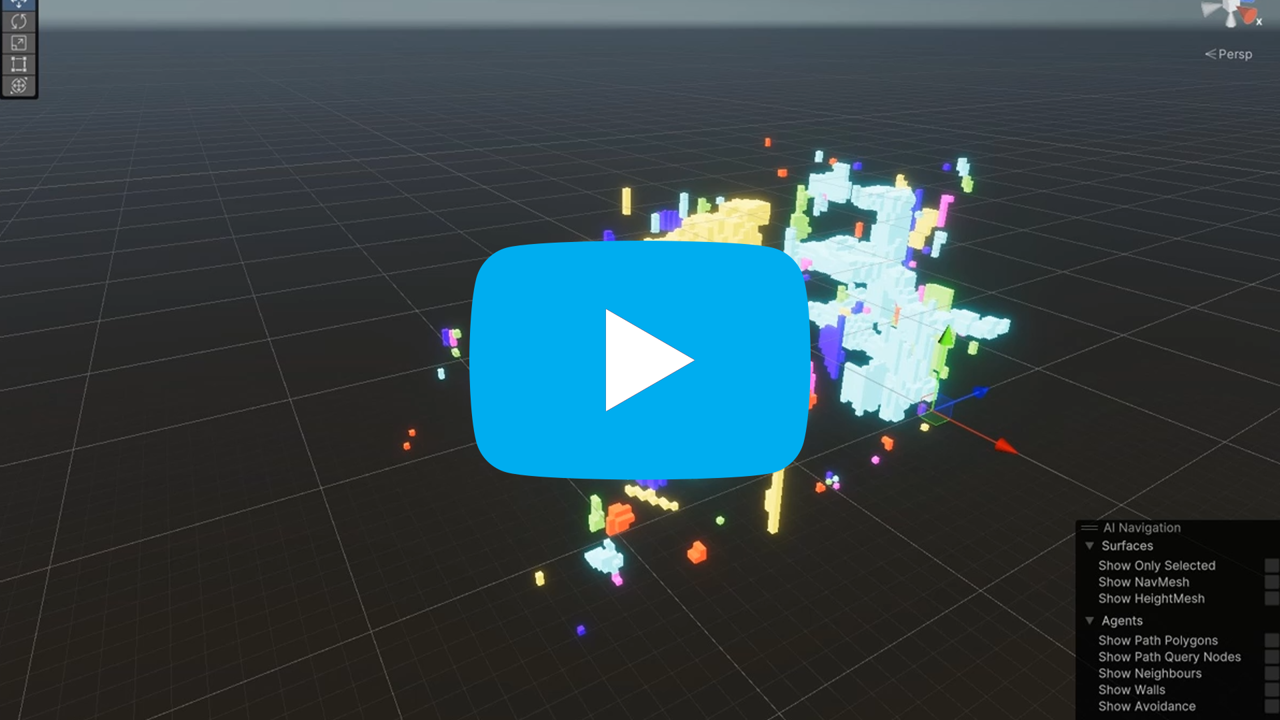
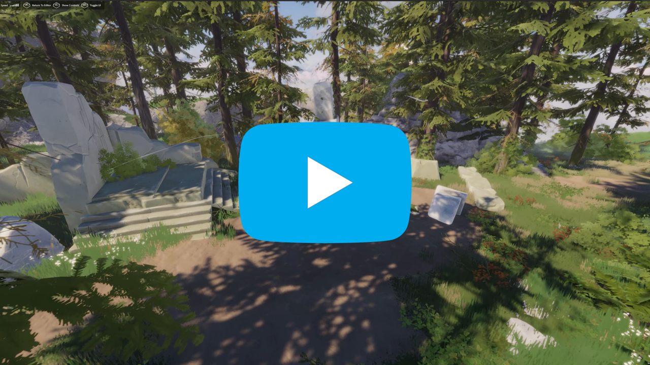
We've shared some of the updates we'll be sharing below with you quite recently, back in Skywatch #4 - Islands in the Sky but we're reposting them again, to give you an idea of how recent some of the content we've been sharing with you actually is. So first up, the cave detection system and region 1 island set-dressing flythrough vids below were both shared in Skywatch #4, but are fairly recent work so it's worth sharing them again.
And now on to some recent island updates that we haven't yet shared with you. First up, an updated look at our ivy generator and moss being applied to some of our island assets.
Next up, in the images below you can see some of the ruins sub-biome/points of interest work that's been started this sprint. Specifically, what you're seeing is us finally being able to do the following:
- Tag objects as ruins of varying sizes
- Add fine detail by using special ruin prefabs
- Allow ruin objects to be tagged as navigable (allows scattering)
This all sounds quite complex, but it basically means that we can assign ruins as points of interest for gameplay purposes and that they can be affected in various ways by our the sub-biome that they're located in.
Below is a look at some of the new island puzzles we've been working on. As mentioned before, we'll go more in-depth on puzzles in a future blog post which will give you more context around our island puzzles.
And finally, the clips below show an updated look at the new lighting system and the initial pass of our first set-dressed region 2 island. Region 2 will be Autumnal in nature, in contrast to the more summery grassy plains and flowery meadows of region 1.
And that's all for today's Skywatch. We hope you're not too disappointed by breaking from the themed format that we usually follow, we'll pick that up again next time but we felt it was important to give you some context around just how current some of the content in the other Skywatch posts is, and an idea of where the game is at right now.
Just a final reminder that we'll be switching to a two-week release cadence for these posts going forward, so no Skywatch next week but hopefully it's worth the wait!
Have a great weekend folks.


