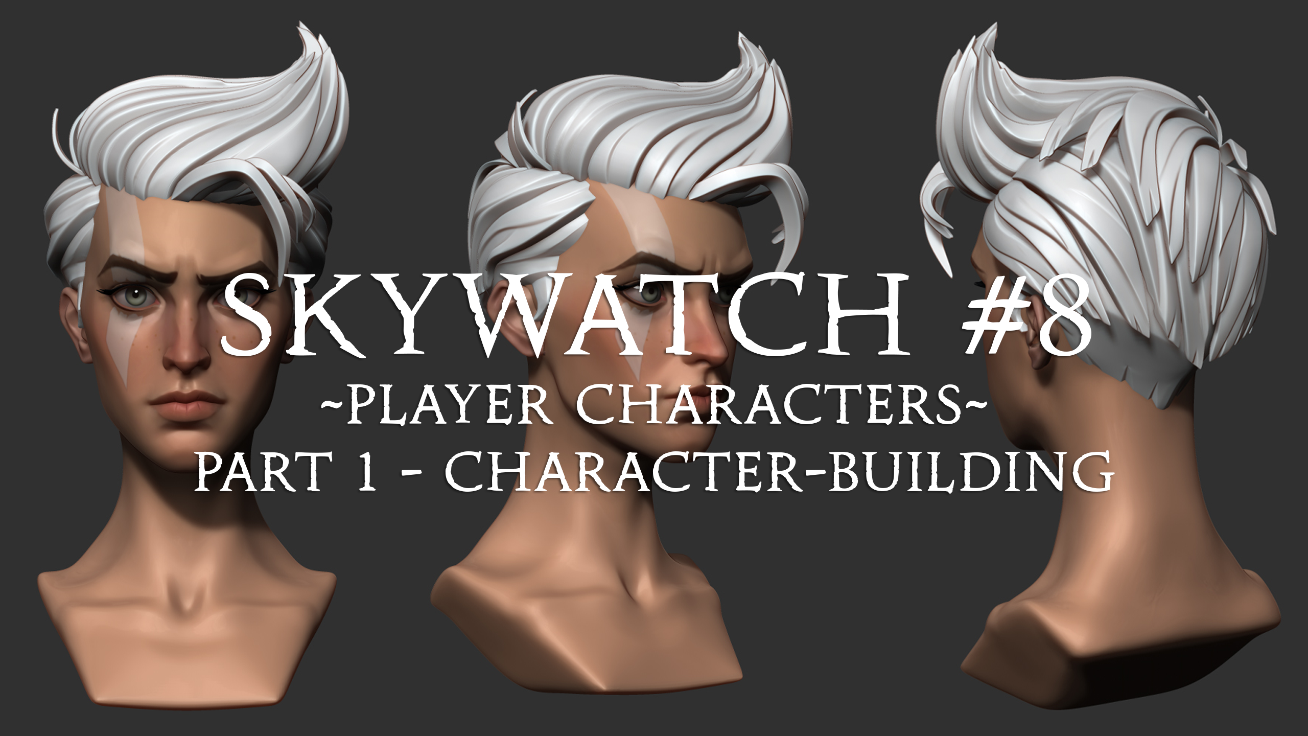
Skywatch #8 - Player Characters: Part 1 - Character-Building
It's time for another Skywatch!
This week, we want to take you through our character building journey! In most modern videogames, the player character, your avatar, acts as your persona in the game. Some narrative games have scripted characters with their own pre-established identities (think Geralt from the Witcher series, or Nathan Drake in the Uncharted games) but in Lost Skies, your character is a blank slate for you to customise and make your own. We'll delve more in to what customisation options will be available in a future Skywatch, but today we'll take you through some of the earlier stages of how our character is developing.
Moodboard
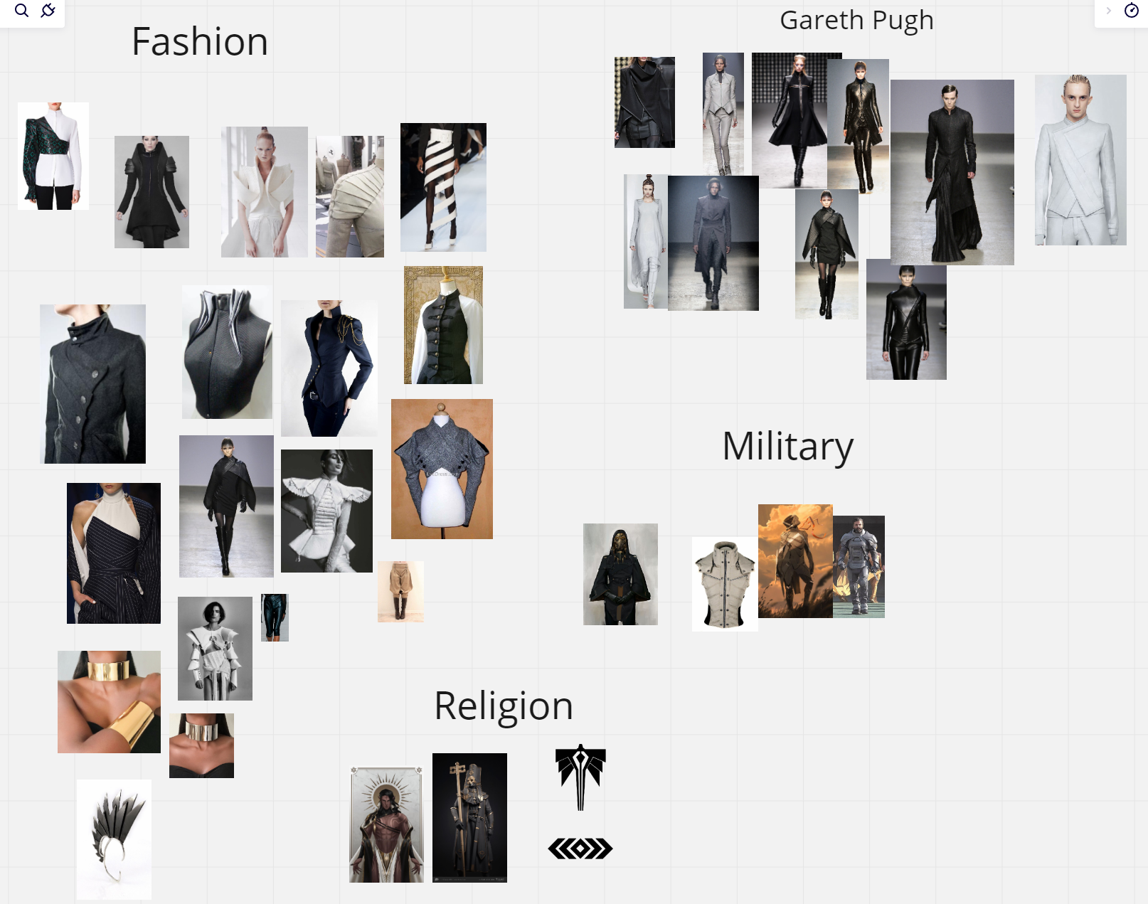
First up, below is a glimpse of our Miro moodboard, which shows some of the character pieces our artists were using for reference early on.
Our artists looked at character designs from a range of games and other media for reference and inspiration. Obviously, Worlds Adrift played a part in shaping our character designs, but we also looked at games like Sea of Thieves, Breath of the Wild, NieR: Automata and Horizon Zero Dawn to name a few.
As you can see in the moodboard, there were a lot of tribal and nomadic inspirations behind our early character designs, but we also wanted to incorporate more advanced tech in our world than what we had in Worlds Adrift, so we aimed to merge more tribal style clothing (lots of cloth and leather garments with flowing elements, cloaks/scarves etc.) with strong sci-fi elements such as metal plates and techy gadgets (think Horizon Zero Dawn).
Original Character Exploration
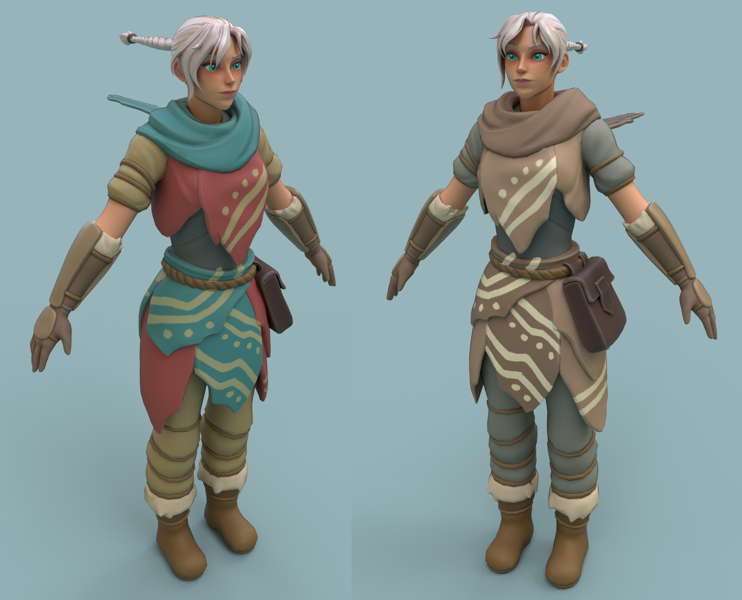
Below is a look at our early original character - this character model was always intended to be a placeholder, which we would iterate on until we achieved the style that we were aiming for.
Aloy from Horizon Zero Dawn was the main inspiration for the outfit, as she wore chunky boots and wrist accessories that bulked up her silhouette and made her feel more "weighty". The cloth around her waist contributed to that effect too. This would also translate into better looking physics and animations during grapple and swing animations.
We began by exploring how this effect could be achieved with different concept outfits from different cultures and climates.
From the concepts above, the bottom middle outfit was chosen for the next stage of concepting, and received a colour and shading pass.
Original Character Render
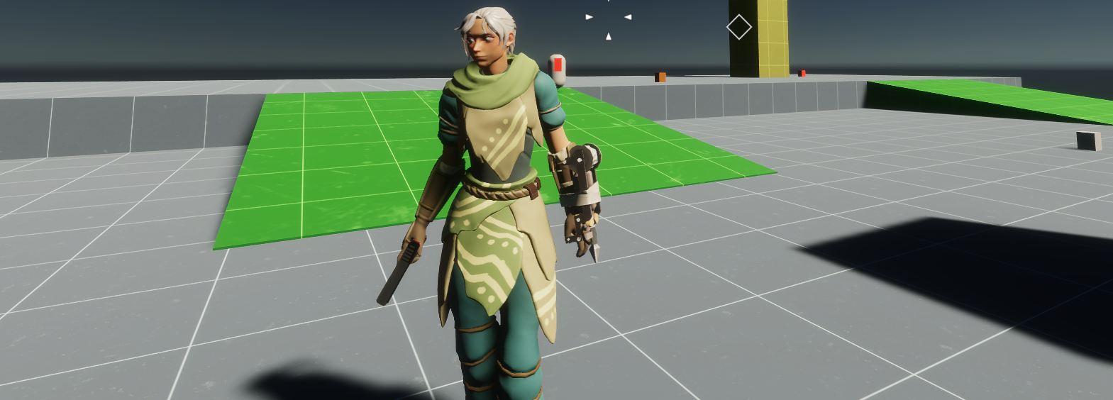
And below is the original render of our initial character model. This model was never meant to be an example of a finished, polished model or sculpt. This was made to test proportions, animations, and materials/shaders in-build.
Hair and Cloth Physics
Below is a look at some of our early hair physics on our OG character model. Tom, one of our developers, wrote a super lightweight verlet physics solution, which actually turned out looking pretty cool and so has since been developed further. We had a couple of existing options for hair/cloth physics: UnityCloth and BoungKit, but both of these solutions came with drawbacks that made them less than ideal for our purposes.
UnityCloth has a couple of disadvantages for our uses in this instance: firstly, it doesn't work great for meshes with larger internal volumes like hair, it's mostly useful for flat objects, and secondly, the execution time of the simulation is not controllable, so if it doesn't line up with our update by chance you get a visible 'pop'. BoingKit keeps the mass in check, but for some reason had this odd effect of stretching the first node in the chain. Tom couldn't find any settings to get round this. The custom solution handily fixes all of those things. Additionally, it's much more resource friendly than UnityCloth.
Takeaways from this model:
Positive
- After a coat of paint her face turned out quite nice
- The scarf and hair worked very well with Tom’s cloth physics system, and added secondary animation to the model
- The tint maps worked well
- Did it’s job well for early prototypes and allowed for experimentation
Negative
- The thick cloth skirt was a pain to model and rig
- The proportions of the outfit could have been pushed much further, the team decided they wanted to go in more on the stylization for future iterations
- The hair was similarly arduous to sculpt and retop, the team wasn’t completely satisfied with the result
- The underlying anatomy ended up slightly odd as it was designed for the outfit on top of it
Next steps:
- Deeper research and concepting to solidify art direction for characters (texture, anatomy, stylization)
- Concept male body type
- Research eye shaders to help them look lively in engine
- Rework the base sculpt with stronger style
- Adjust proportions
Our team took these learnings forward into the concepting stage for our new character model.
Early Concepts and Anatomy
As a starting point for our new character, we asked other artists on the team (some who had previously worked on Worlds Adrift, and some who had not) for their opinions of the Worlds Adrift style for characters.
One of the biggest takeaways from this feedback was to move away from the spidery long limbs and give the characters better animations.
New Character Initial Designs
In the initial designs for our newer character, we were trying to balance the original style of Worlds Adrift but apply it to a less stylized body. Link from 'Breath of the Wild' was the main reference, as he animated very well and had a good amount of weight to him when climbing and gliding. Chunky limbs and a stocky body means that it would look better while grappling, which the player will be doing for a lot of the game.
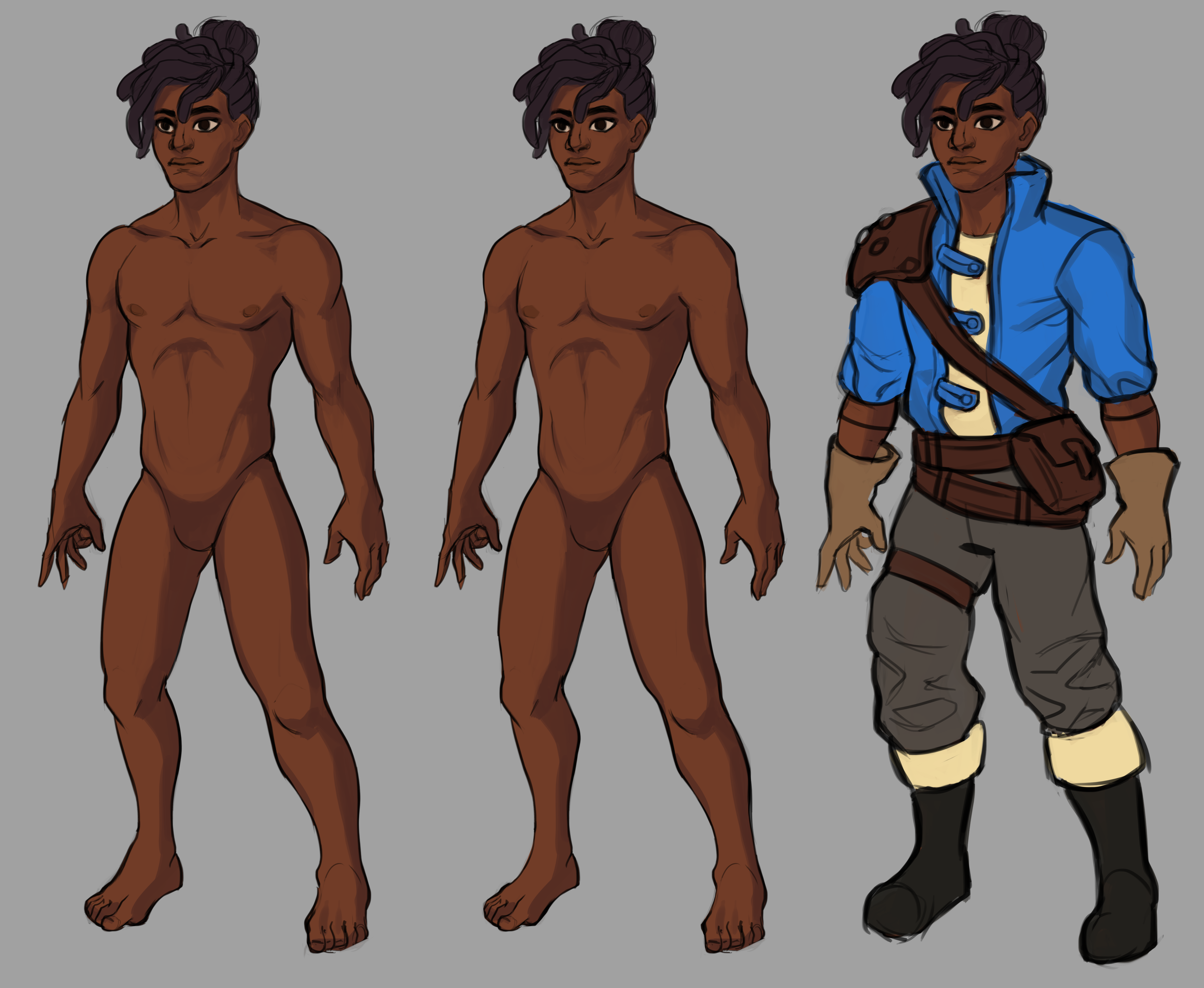

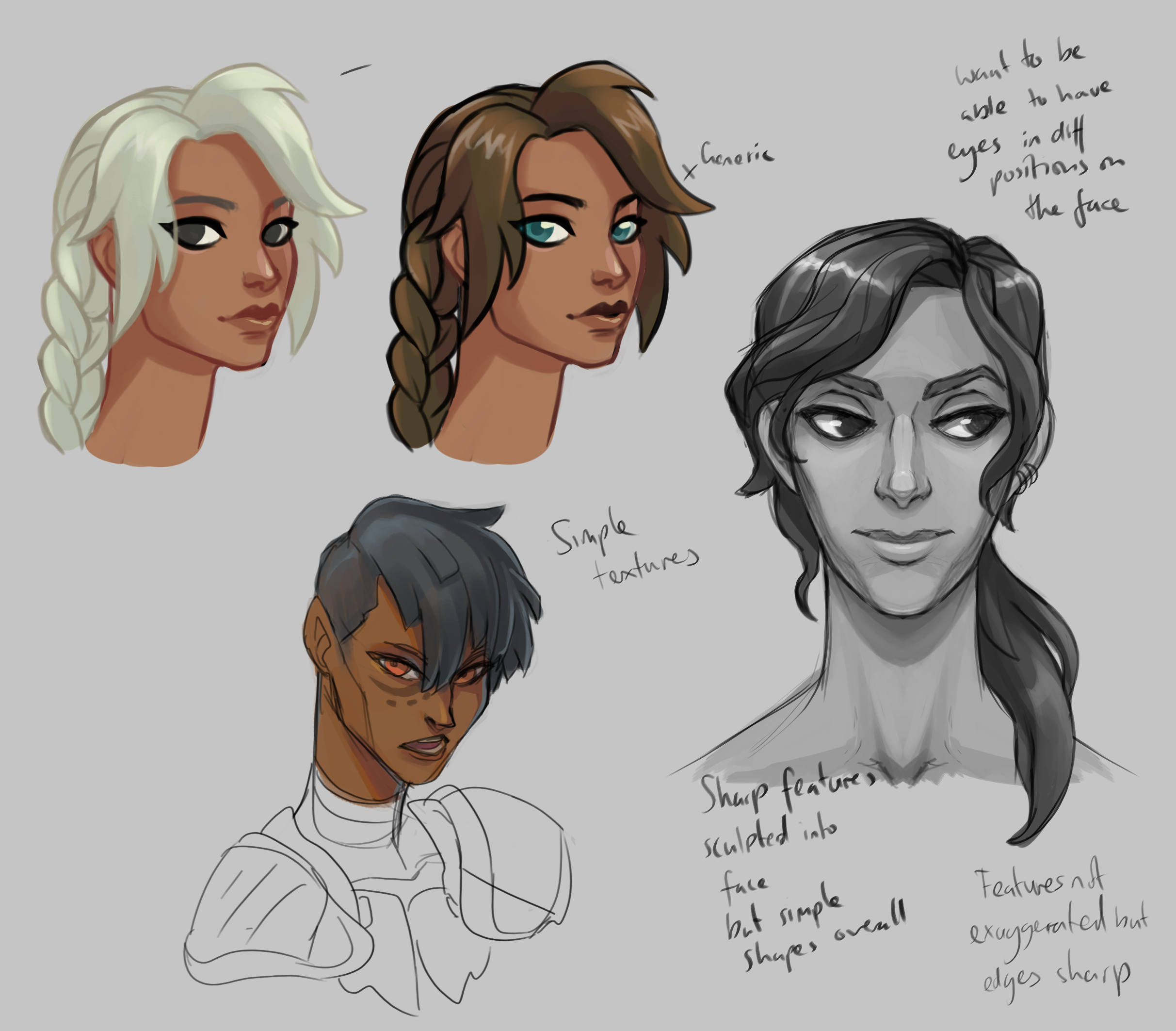
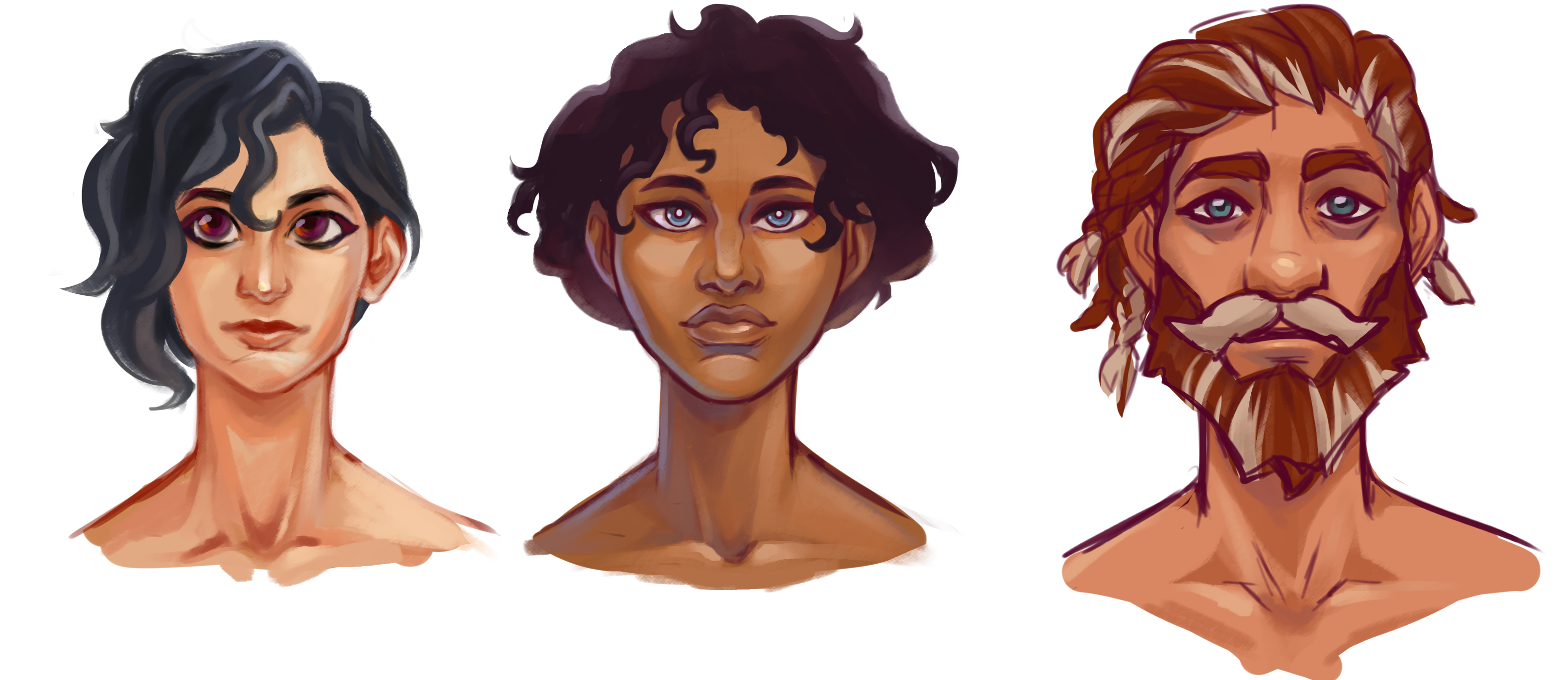
Takeaways from this phase:
- We wanted more detail on the faces, but stayed away from realism or extreme caricature. (Pixar is too simple, Sea of Thieves is too exaggerated for example)
- The team was partial to having them retain some of the sharpness of the original models, but soften out some of the planes
- Adding detail to the nose and lips achieved this pretty well
- Higher detail and more sculpted hair was a must
- We finally gave up on having huge WA eyes
External Concepts
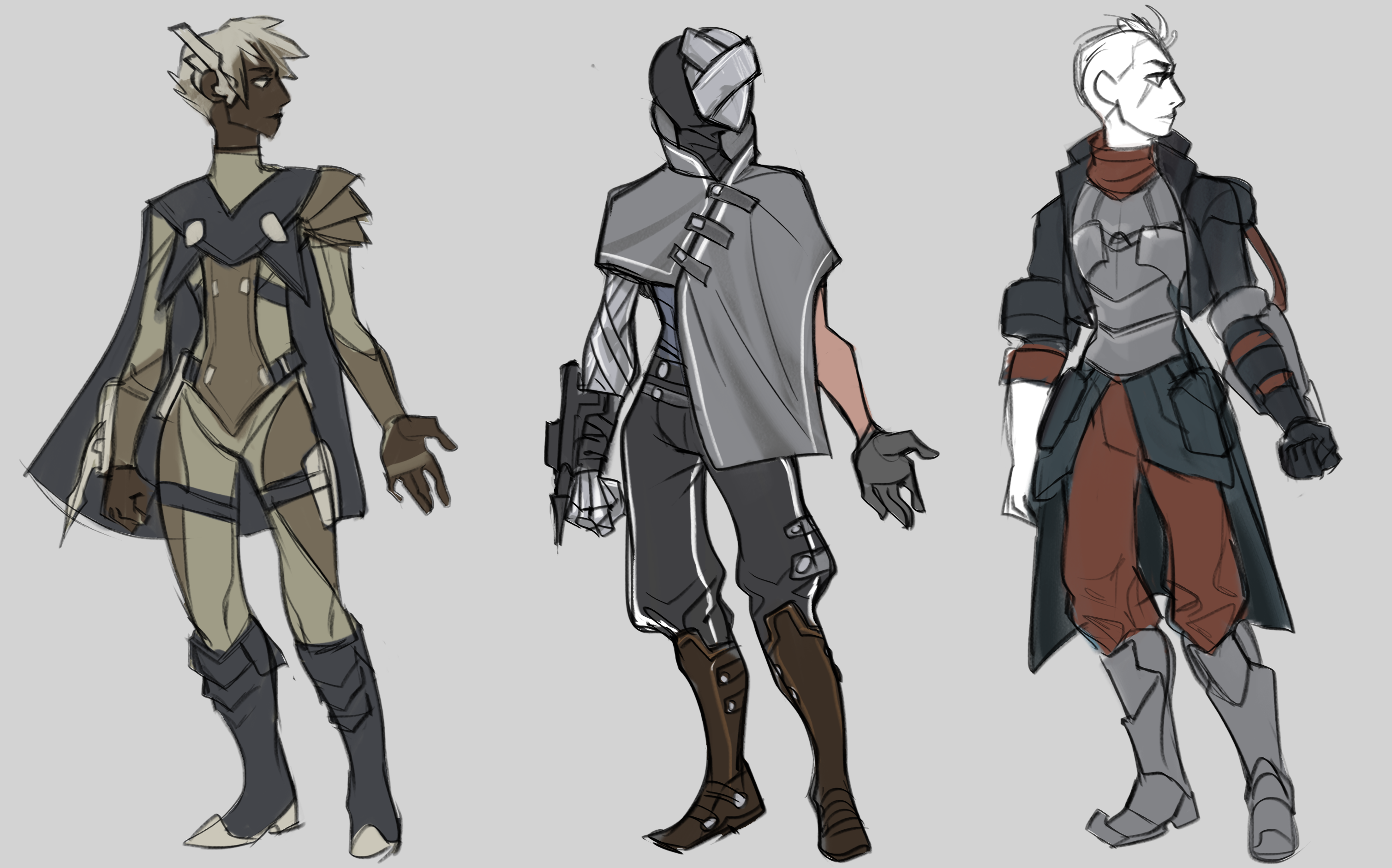
The next step was to commission some external artwork to further develop our concepts. Brainbug was commissioned to concept more designs for Lost Skies.
The task was to meld together two design elements - ragged, tribal-type clothing, with scavenged high-tech accessories. This was to explore how the player might look at the beginning of the game. Having just emerged from their sleep, their clothes would likely be worn by the passage of time, or they were only able to find scrappy pieces of clothing left from old civilisations. However, the tech would still be in good condition due to the metals etc constructing it.
Takeaways from this phase:
- Each element of the design felt quite disparate and lacked cohesion
- However, this was towards the end of their contract so there wasn’t enough time to further iterate on the designs
- Definitely some interesting ideas and shapes in the concepts that we decided we could take forward
- We discovered that apart from helmets or the grappling hook, it is quite difficult to introduce sci-fi elements to the design while avoiding generic ‘glowy bits’
- We wanted the tech to look like something not of this world - it didn’t run on circuits and wires like our technology but something more advanced
- The grappling hook concept had a nice pseudo-ancient look to it, evokes ancient Egypt
Saborian Outfit Concepts
Having made some solid progress on our character concept, we decided it was time to explore some outfit concepts. We've already shared a lot of the thinking behind our Saborian culture with you in Skywatch #2, but in the interest of context here's a short deepdive into our rationale at this stage of our character design phase.
This set of concepts was the establish some Saborian outfits and design language, as we decided quite early on that the first area of the game that players would explore was likely to be in the remains of Sabor.
Luke outlined the Saborian culture and religion to give the team a better idea of how they would present themselves, any social hierarchies, and for any iconography that could be incorporated into the design. The architecture and statues from Worlds Adrift were also helpful in establishing the hard-lined, simplified style the Saborians preferred.
“The Sabor have unique religious practices. In their utopianism, all citizens associate themselves as gods. This belief, both internal and external, promotes a common sense of pride and respect. A great deal of emphasis is placed on physical perfection and fitness.”
The Saborians have an interesting and contradictory attitude towards individuality - as an individual you are expected to excel in all aspects, but you are also a representative of a greater culture. Also, the godhood they strive towards is one that annihilates the individual, instead ascending into a collective consciousness.
This creates interesting themes to play with with respect to clothes:
Equality
- The “all Saborians are equal” attitude could carry over to the clothing, no one is allowed to surpass one another, uniformity and conformity is ideal
- This was seen in the Saborian military uniforms designed for Worlds Adrift, but this could be argued that it serves a different purpose. It is to make the soldiers feel a part of a collective, that they are fighting for a nation rather than their own lives.
- Lots of godhead masks, disguising oneself as an individual
- A downside is that this doesn’t create the opportunity for exciting and dramatic end-game clothing or equipment, since the designs would be very uniform and not particularly unique
Self Deification
- Saborian fashion could demonstrate the divinity of their people - both to the wearer and to outsiders
- Important and high ranking officials could wear extravagant outfits designed to intimidate and awe. The Saborians believed in their superiority over all other cultures and might have worked to remind them of that
- Despite the tenet for Saborians to help each other and those less fortunate, there is an element of self-service to their altruism. As with all cultures, there are those who will strive to be seen as ‘better’ at their religion than other people. They might wear outfits more ‘godly’ than other people
Deserters and Outcasts
- Sabor had its share of outcasts, made up of the elderly who refused to die and ascend to godhood, or those who simply did not agree with the culture
- As they lived on the literal outskirts of society, their clothes could serve the purpose of being early gear for players as they make their way towards the ruined cities
- Their clothes would be less preserved, and less intricate than their city neighbour’s. Both because they lacked access to the latest fashions, and the means to upkeep them
- Small trinkets and heirlooms can hint at the previous owners connection to Saborian society
Inspirations:
- Fashion designer Gareth Pugh
- Modern/high concept fashion
- Anything with bold, simple shapes and hard edges
- Asymmetry
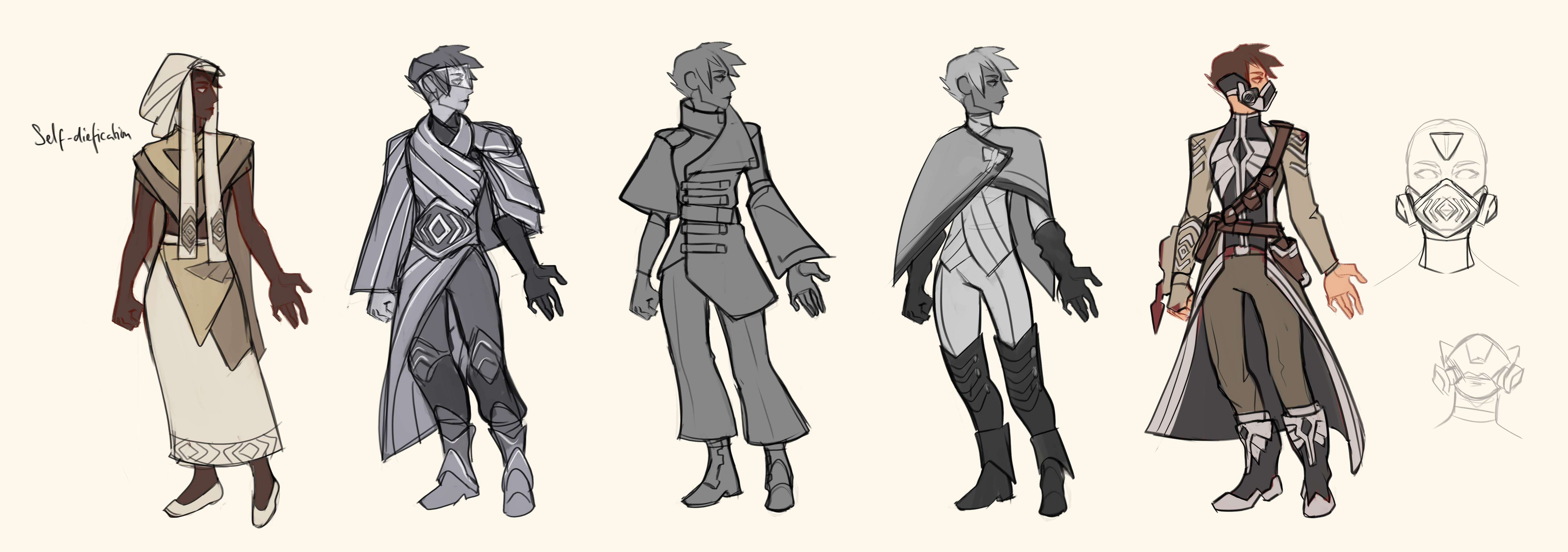
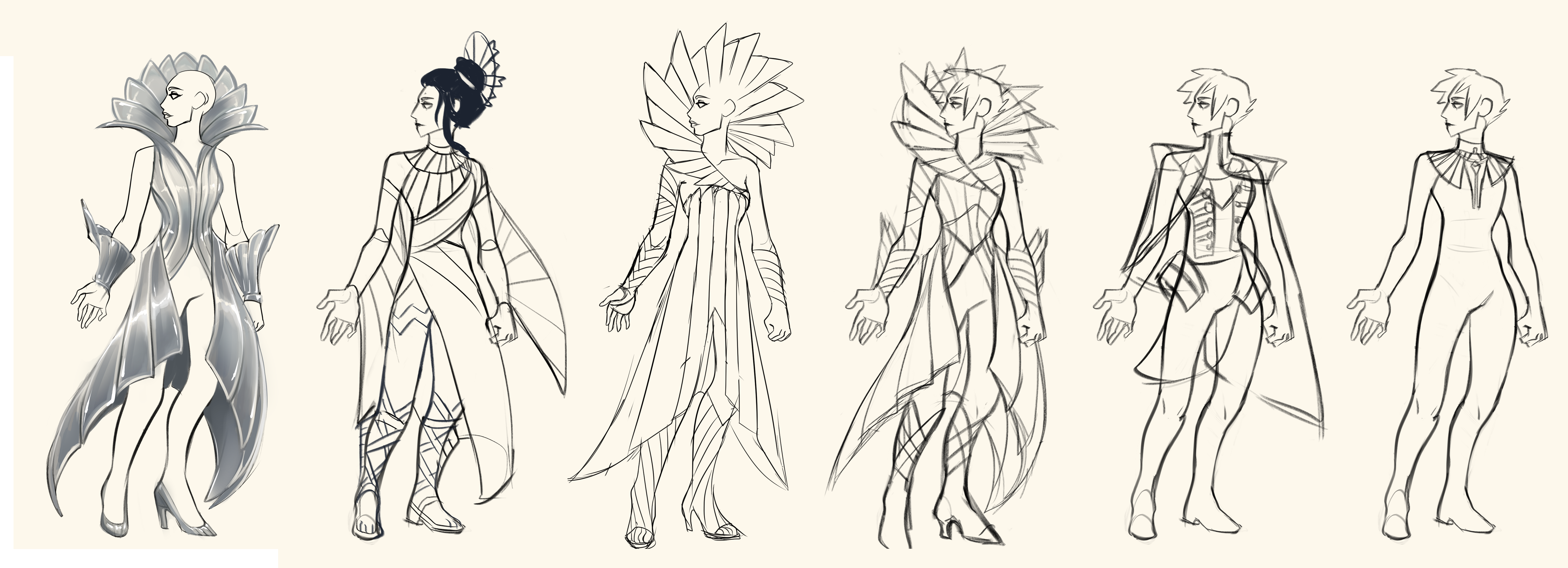
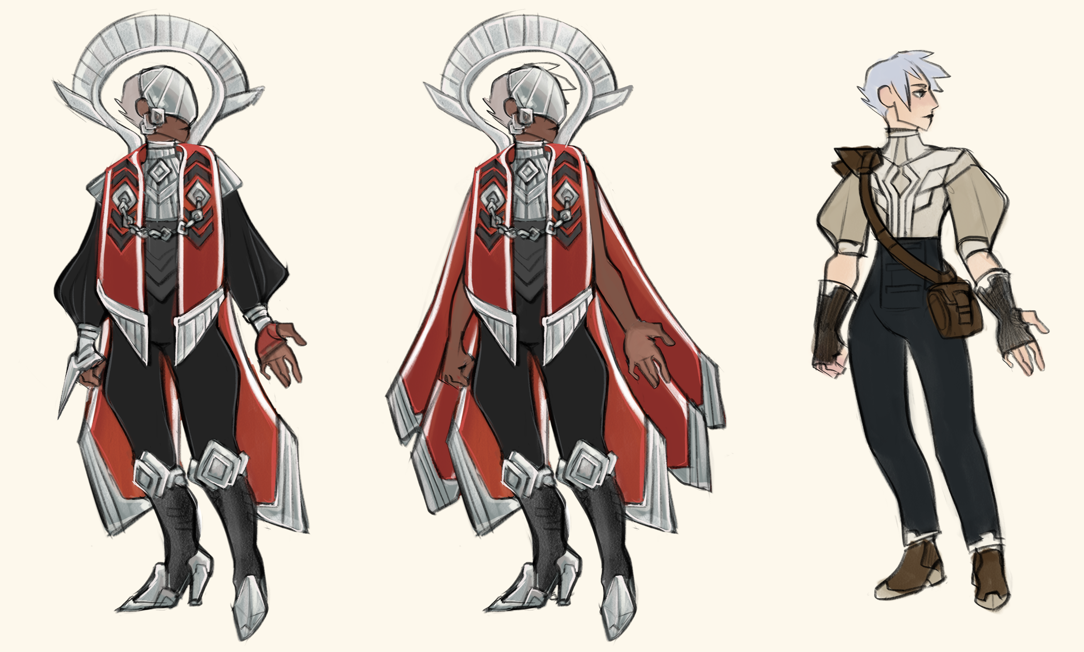

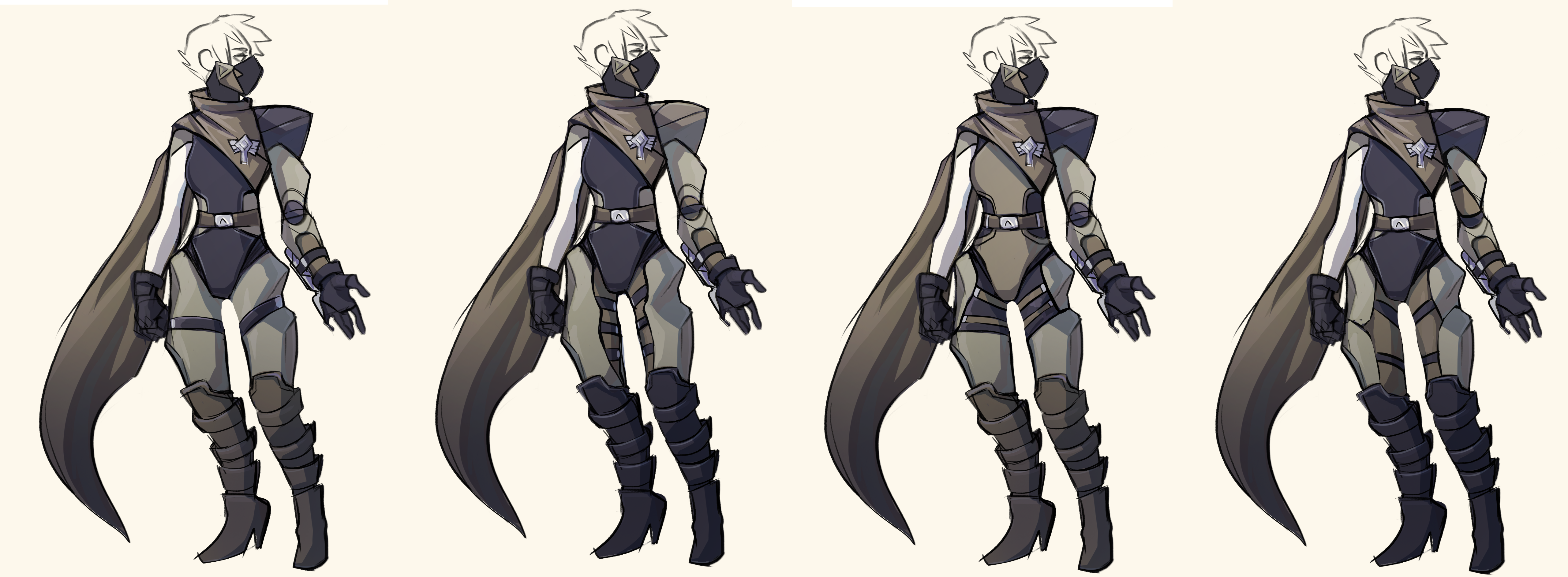
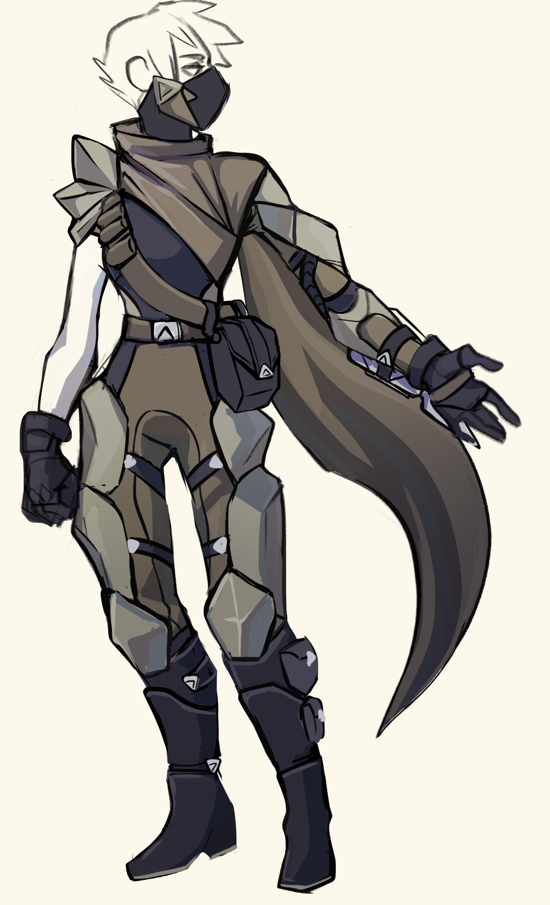
And below is the finalised concept piece we came away with following this design stage.
New Character Model
With a clearer direction and aesthetic goal in mind, our artists could begin work on concepting and sculpting early versions of our updated character model. We started by further exploring our Saborian outfit designs, but in more detail.

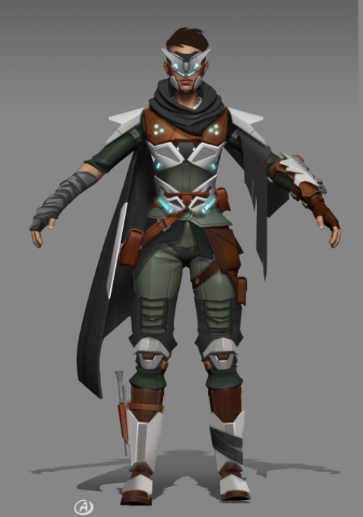
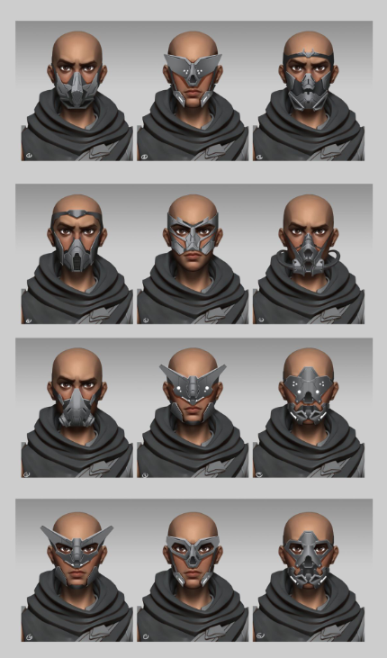
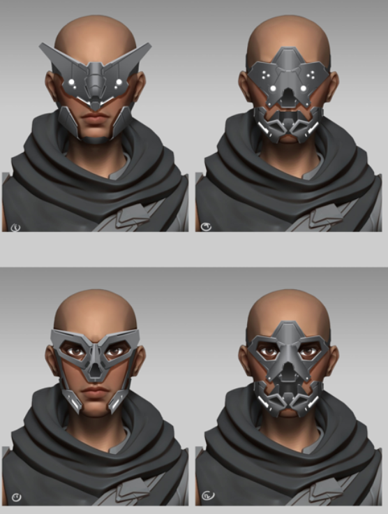
Female Model
From here, our character development is a combination of creating sculpts of our character naked, as well as wearing our first Saborian outfit. We started with the female version of our character model.
The bottom image shown above shows our first Saborian outfit after a texture and shader pass too. Parallel to this, work was started on our higher detail character model, with an emphasis on facial features, including our first hairstyle. The female character was worked on first and in the sneak peak at one of our character miro boards below, you can see that the artstyle from the animated League of Legends tie-in TV series, Arcane, was a strong source of inspiration at this stage.
Bear in mind that we'll be offering character customisation, which we'll give a more in-depth look at down the line, this is just our initial character model that matches the aesthetic and detail level that we're aiming for for Lost Skies.
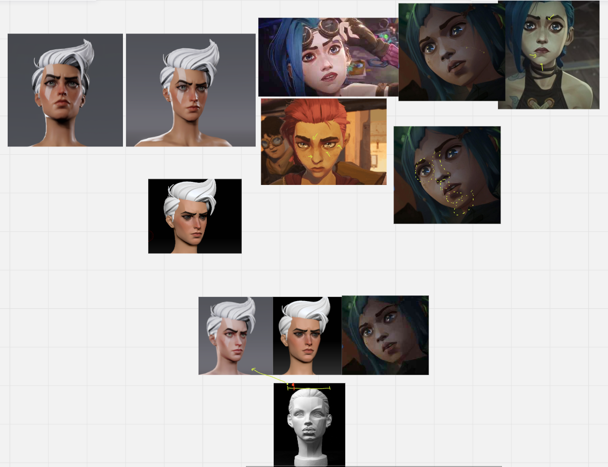
With this artstyle locked in, it was just a case of further iterating on the design and getting the amount of detail we wanted just right, which is further demonstrated below.
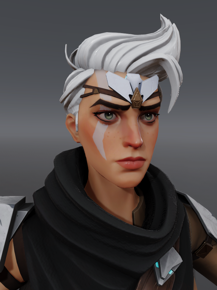
Male Model
Now that we'd reached a point we were happy with for our female character model, we could begin work on our male sculpt, which is shown below.
Character Animations
Once we were happy with our character model, it was passed off to our animation team to lay the groundwork for the many character animations that will make our movement system feel fluid and satisfying. The gifs and clips below demonstrate a range of early animation work for our updated character model - the first clip shows shoulder rigging and animations to ensure that the shoulders follow natural movement patterns, important considering the amount of grappling our characters will be doing! The gifs demonstrate a range of animations, including crouch walking animations, crouch idle animations and dive roll animations from both standing and running.
The animations below contain a selection of locomotion loops utilising single handed and two handed weapons (weapon models not final).
Each walk and run animation set has 8 directions and variations such as an aim state or relaxed. These animations will work in conjunction with the in-game character system and enable a wide range of traversal and combat options.
The bottom gifs show a set of directional climb animations that will be used for the free climbing system.
Updated Character Model Hair & Cloth Physics
And finally, the slow motion clip below shows off the hair and cloths physics system applied to our new character model.
Of course, all of this work leads to the highly detailed character that was shown at the end of the animated reveal trailer for Lost Skies and in the Steam screenshots for the game.
That's a wrap for this weeks Skywatch! Our character has undergone even more updates in recent weeks, with lots of updated animation work now having being completed. We'll have more to share with you soon! For now, we hope you've enjoyed this look into our character design process and are looking forward to creating your own character to explore the skies with.
Until next time, safe travels nomads!
